How to share the one-pager
You can share the one-pager by copying the link to the report or generating a pdf file. For the first case, the person receiving the link has to have the privileges to access the patient information.
Sharing via pdf is the preferred option if you are sending the report directly to the patient.
Sections
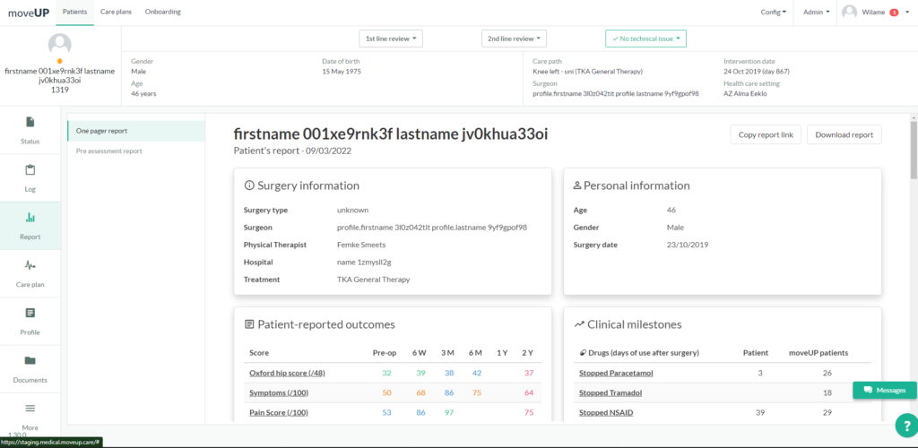
The one-pager is composed of the following sections:
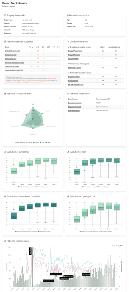
- A header, with the patient’s name and the date when the report was generated as well as a button to copy the link to the one-pager and another button to download a pdf file.
- Surgery information: the details regarding the procedure, such as the limb, the surgeon’s name, the hospital, etc.
- Personal information: the details of the patient.
- Patient-reported outcomes: the medical scores results.
- Clinical milestones: when the patient reached a milestone, compared with the moveUP population average.
- Patient’s scores over time: a vision of the Patient-reported outcomes in a spider graph.
- Patient’s compliance: the compliance of the patient regarding the exercises, the step synch, etc.
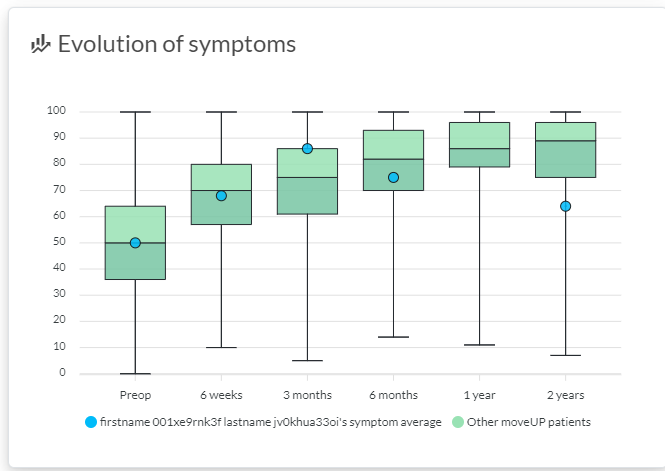
- Evolution of symptoms, pain, Activity of Daily Life, and Quality of Life: shows where the patient is placed in comparison with the moveUP population.
- Patient’s evolution data: a chart with complete information about the steps, the pain, the stiffness, the milestones, and other data, showing the patient’s evolution.
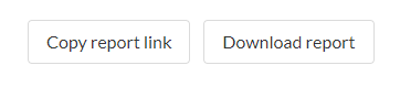
Surgery information
Overview with information about the surgery and the treating team
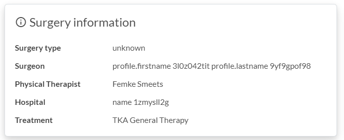
Personal information
Contains the basic information about the patient
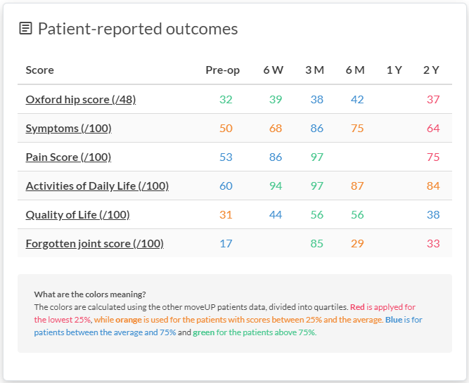
Patient-reported outcomes
Here you can find the calculated PROMs for the patient. The colors have meaning and show in which quantile the patient is located, compared to the moveUP population.
What are the colors meaning?
The colors are calculated using the other moveUP patients data, divided into quartiles. Red is applied for the lowest 25%, while orange is used for the patients with scores between 25% and the average. Blue is for patients between the average and 75% and green for the patients above 75%.
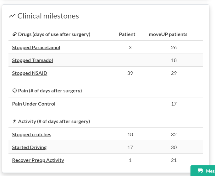
Clinical milestones
Shows when the patient reached a milestone in days and compares the patient to the other moveUP patients. The patient column shows the day when the patient reached that milestone. The moveUP patient’s column is an average for all the patients. If the column is empty, there are currently no data available.
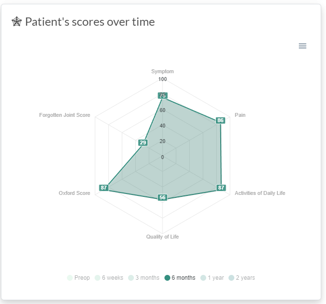
Patient’s scores over time
This spider chart shows the same information found in the “Patient-reported outcomes“ card, but it conveniently organizes the information in a more visual way. The patient can compare their scores with the desired period.
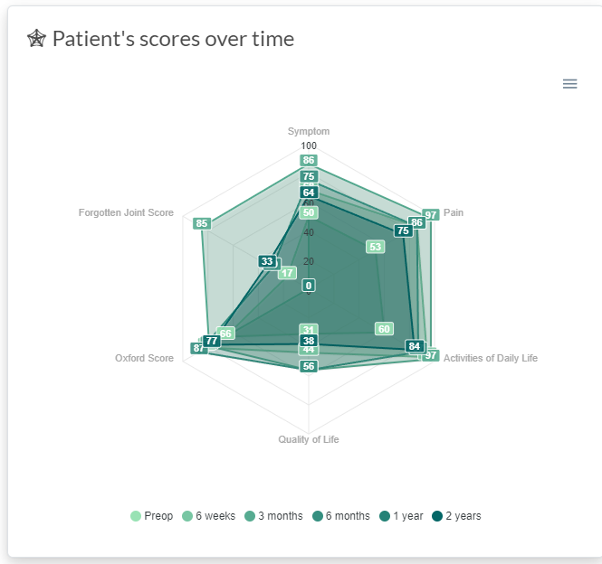
If you click on the legends, you can hide or show a period. This is valid for all the charts with legends
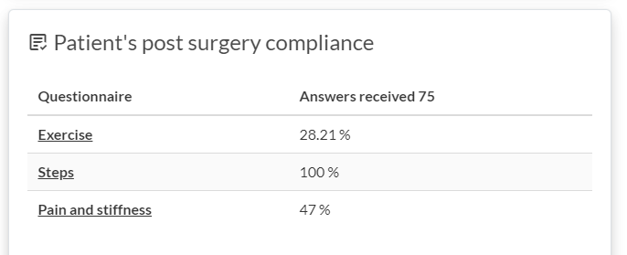
Patient’s post-surgery compliance
The compliance card calculates the number of requests made to the patient and how many times they answered these requests.
Evolution cards
This is the same principle for “Evolution of symptoms“, “Evolution of pain”, “Evolution of Activities of Daily Life“ and for “Evolution of Quality of Life“
Shows the score of the patient compared to the moveUP population. The chart is in the boxplot form, so you can easily visualise the quantiles.
Patient’s evolution data
This is an overview of the patient’s activity with moveUP. Here, we can see the evolution of the pain, the activities, the stiffness, the milestones, and the surgery itself.
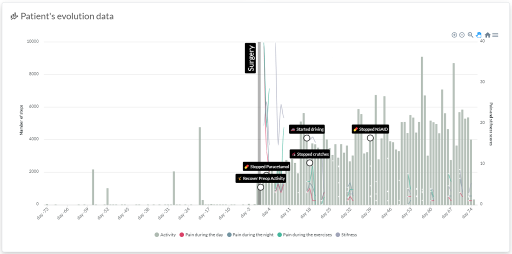
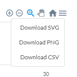
You can use the controls to zoom, navigate and isolate parts of the chart.
Hovering into the chart will give you a more detailed vision of what happened in a given day.
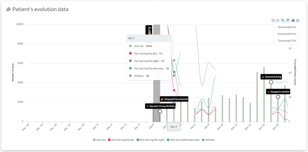
If you click on the three lines in the right top corner, you can save the chart as an image.
Report overview
How to access
You need to have the necessary privileges and your patient has to be in one of the care plans for which the one-pager is activated to see the one-pager.
- Login to the medical dashboard
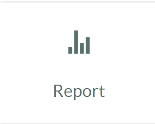
- Select your patient and click on the “Report” icon:
3. Choose “One pager report” in the new screen:

4. The one-pager will appear embedded in the medical dashboard: